⟵ Go Back

Cafépress UX/UI

TL;DR
Alex produced interactive prototypes to lay the foundations of information architecture and navigation patterns for a major online retailer's mobile strategy.
mobile device with cafepress app next to steaming coffee mug

Moving the Cafépress platform to a mobile friendly solution is no small task. As one of the web's top 500 retailers, it needs to done right the first time. Strong information architecture lays the tracks for complex connections and recommendations. Simple UI means quick, casual browsing and editing. Clever copywriting and easy-to-use social features make users feel like they're part of a small community. Way finding and algorithmic suggestions keep users engaged. All the while the product remains center stage.
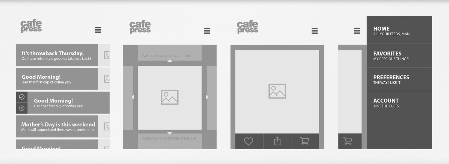
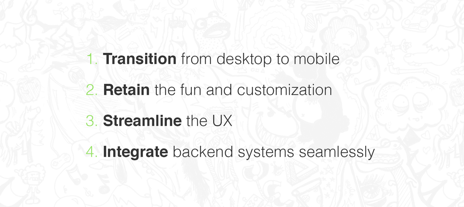
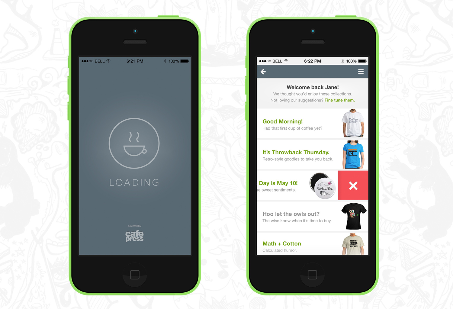
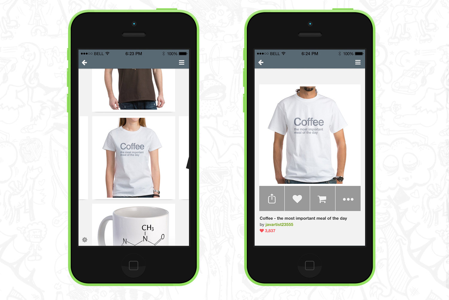
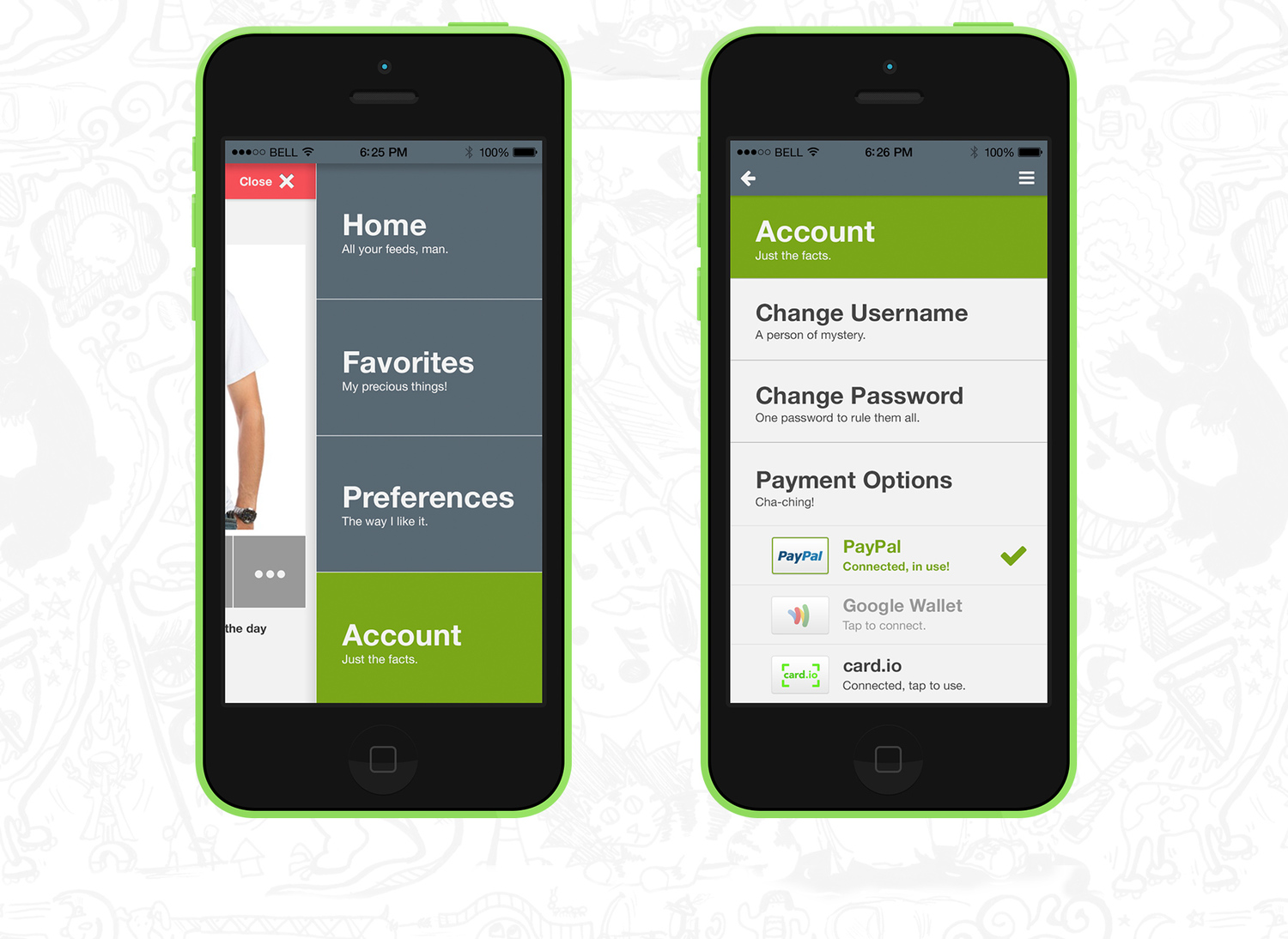
wireframes Transition from desktop to mobile. Retain the fun and customization. Streamline the UX. Integrate the backend systems seamlessly. app screens on devices: loading, swipe to delete app screens on devices: visual product feed, detail screen app screens on devices: menu, account screen

Project Responsibilities

Project Team


Would you like to see more?