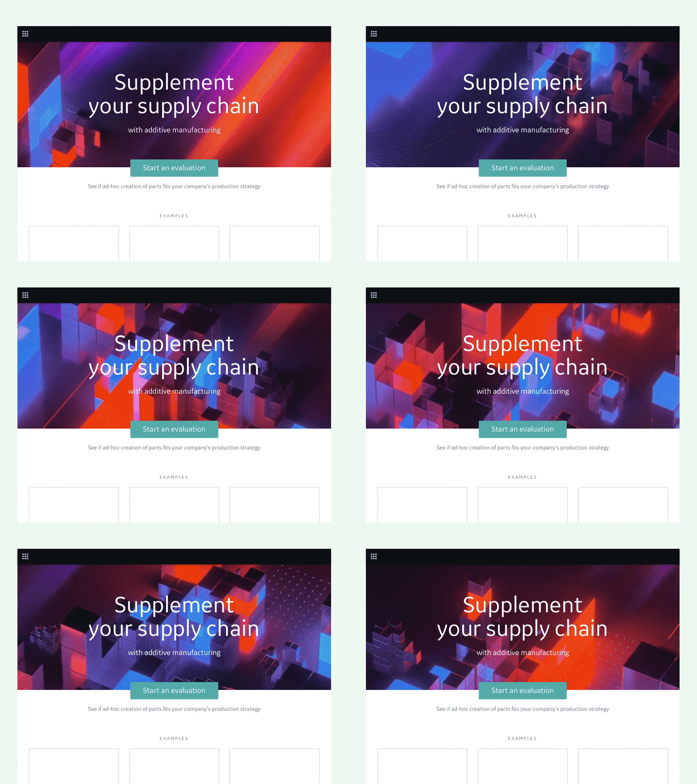
Over 6 months I helped take an ROI calculator for GE Additive from idea to production. The tool evolved from a spreadsheet, to a web app complete with 3D model visualization. My role over this time transitioned as well, from researcher, to designer, to product owner.

Knowing which project to pursue before investing time can reduce waste. Additive manufacturing is equal parts rapid prototyping, and industrialization of complex designs. The long-cycle nature of additive for production parts in aviation requires extra vetting. The creator of an Excel Sheet to calculate material costs became the product owner. Working with two partners in UX, I lead some interviews and participated in others. Stakeholder interviews with GE Additive exposed how engineers solicited and evaluated new ideas. User interviews pointed to where we could iterate on the existing calculator.
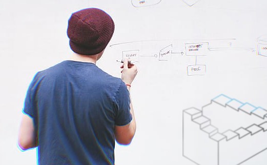
Along with a business analyst, we synthesized our findings. The research pointed to many process improvements before and after the calculator's use. For the time being, we focused on four aspects. First, we would democratize the logic in the calculator by bringing it online. Next, we would improve the logic by incorporating new aspects of an additive project. Then we would ensure the tool's accessibility and usability. Finally, we would package results in a way that was easy to understand and exciting for customers.

The first design challenge was to ensure users comfortable with Excel would feel at home in the new tool. We translated our sketched user flows into Axure prototypes for testing. A/B testing of two approaches required thorough and unbiased test designs. The tests ran and pointed to clear result that met expectations of users' mental models. A simple form structure that used progressive disclosure replaced an all-powerful spreadsheet. I performed a few different tasks in prototyping and testing. I created one of the two prototypes. I co-designed the tests with a researcher. I then ran half of the tests with end users while observing the rest.
The new tool would incorporate many new aspects and measurements the old tool lacked. Users learned of new functionality through training, coach marks, and tool tips. The UI and inputs had to be intuitive. The tool was for global use, so internationalization design considerations around were included. We accounted for responsive design for any language. We made it easy to receive inputs in various units of measure. Accessibility was a must, given inputs and outputs would be shared externally.
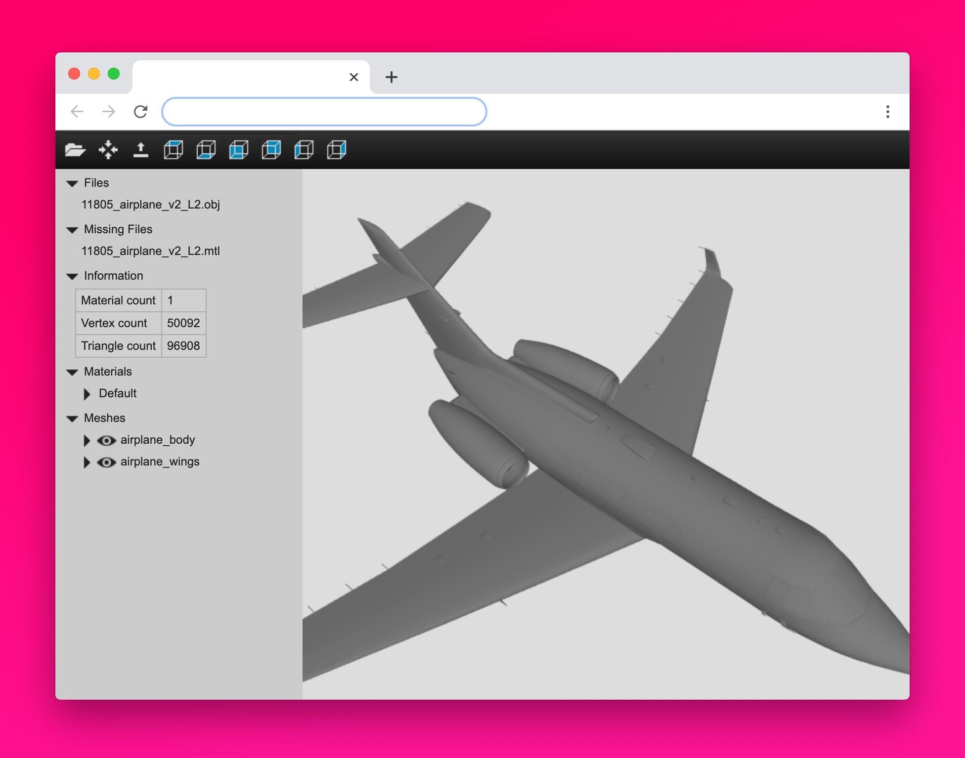
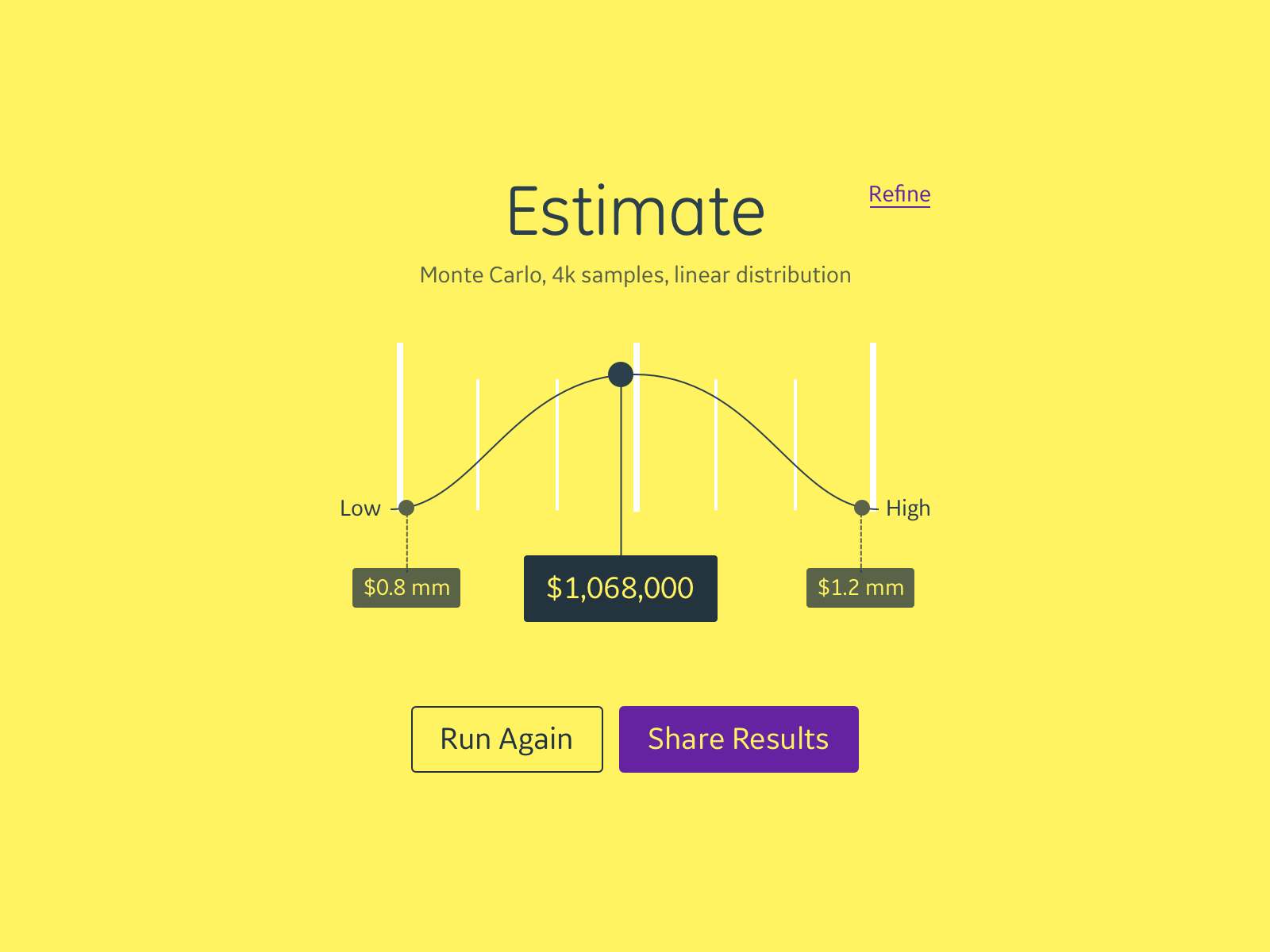
The last, and most nuanced design consideration, was showing competence and inspiring confidence. The tool's logic was sound, and the audience was primarily engineers. We found that exposing a distribution of ROI rather than a discrete number resonated. The numbers are what mattered, but confidence in how they were reached sealed deals. Visualizing 3D models in the web tools, immediately connected users to their project. Seeing their thing made it feel real. Tests also found that the quality of the model didn't matter. A rudimentary, low polygon model shown on screen users could rotate was more than enough.
A late pivot to the product saw us focus on an admin section for the app. Admin users needed a way to tweak material costs and formulas without a development team. With a new, smaller set of users identified, we followed a similar pattern as the rest of the app. Interviews, co-design sessions, prototype, and test.
About half way to our MVP, the scrum master and business analyst left for other opportunities. The UX team also lost a resource, reduced to 2. Shortly thereafter, the product owner recused themselves of their agile duties. Someone had to write user stories and acceptance criteria. Being closest to the users and the business value, I took up the task. I wrote smaller, less technical stories in traditional format, which was new for the team. I ran user stories through an app called Hemingway to reduce the reading level. This increased understanding of the value provided by features and stories. It also and decreased complexity of deliverables and increased the team's velocity. I wrote acceptance criteria in gherkin format while keeping up on prototypes. Our backlog was healthy. My UX counterpart for the remained of the project was able to stay focused on creating a north star vision.
Our final deliverables for the project were threefold. We needed to produce an MVP. We wanted to have a healthy backlog and a way for users to contribute ideas to it. Finally, we would produce a pitch on how the product might expand across a broader process.
Along with user stories, I created UI assets in Sketch and delivered them to engineering via Invision. The handoff from design to development was seamless. The layout, graphic assets, and CSS values were all there for developers to run with. This was the first time Invision was used in software engineering org, but has become standard since.
For each user story for a value added feature, I took a good, better, best approach. "I need" user stories were developed as our MVP. "I want" user stories informed how we might iterate on a feature to provide more value. At the time of delivery of our MVP, I had a backlog of over 20 groomed stories.
For our north star pitch, my research partner and I returned to our early synthesis. After performing more stakeholder interviews, we were able to articulate a broader vision. We then produced a deck and video that told our story of how the tool would fit into an iterative additive product ideation lifecycle.
After the successful MVP launch I was asked to focus my efforts on another product. I was able to wrap up with research artifacts, designs, backlog, and processes in place that would support the team for many sprints to come.