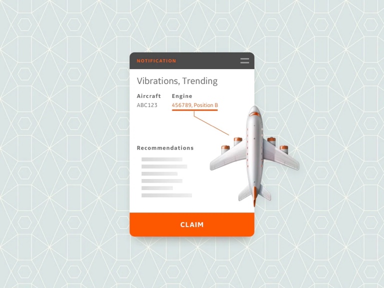

As an Experience Architect, I spent two years designing a product and service ecosystem for GE Aviation Fleet Support. Don't worry, iteration is part of the plan, this isn't a story about chasing waterfalls. The initial ask was to merge a portfolio of over 20 apps by way of a single UI. The apps shared a common mission; keep fleets airworthy and making money. This means diagnostics and monitoring of a global fleet of more than 24,000 planes. As it turns out, there was a lot more to it than a slick new interface.
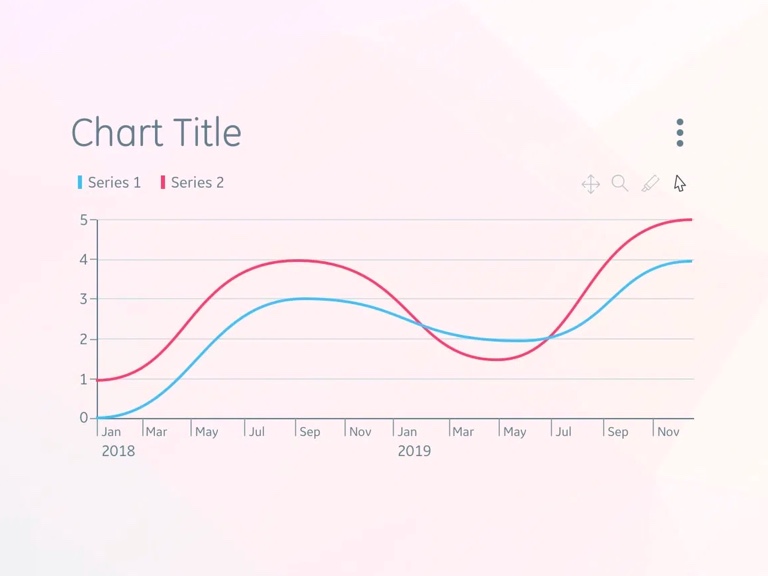
I introduced myself to Fleet Support as the fourth successor to their ask. Various UX practitioners had started and stopped with the group, so I had a wealth of prior research at hand. My first step was to brush up on existing artifacts and interview notes. This gave me the lay of the land, but would need validation as years had passed. I familiarized myself with applications, auditing their capabilities. Then I engaged with stakeholders to learn their goals and begin validating.
When we started talking personas and value streams, things got much more complicated. All major workflows started and ended with external users. Customers needed the ability to self-manage their data and assets. We needed dashboards to track KPIs for transactional processes. That meant airtight access provisioning and user management. Access, security, compliance, and branding became even more important.
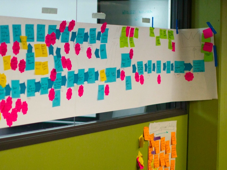
The output of my research would need to lead to a vision for the VP of Product. That meant more than a clear view of the user and the jobs to be done by the services in the tech stack. I dove deep into data sources, and legacy technology. I explored the customer experience by way of contracts and sales. The result was an initial design for a new product offering that would put more power directly in the hands of the customer. Airlines make the decisions for the assets they own, Fleet Support enables them to go faster and work smarter.
I put together a set of personas, and validated old journey maps. More interviews. More ethnographic research.
Dane Petersen, who had worked with Fleet Support in the past, joined the effort as a UX Technologist. With his expertise in development and information architecture our proposal stayed realistic.
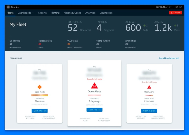
What if it just worked? What if airline customers and GE Aviation associates had direct access to actionable data in one spot? I worked with Dane and the product owners of existing apps to create a vision worth striving for. A coded prototype with realistic data allowed stakeholders to dive right in. We took the prototype to users for feedback and buy-in. Associates and customers alike loved it. Finally, we produced a product design vision deck. Packed with user representation direct from research, we knew where to start.
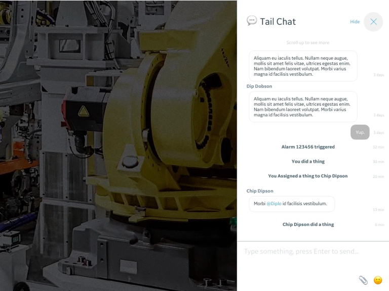
The next step was to form a true product team. Product aligned to the product design vision, and used it to form a true product strategy. We were ready to secure funds, but would we form a team, buy and augment solutions, or something else? GE Digital had a Asset Performance Management application built mostly on requirements from GE Power. One software engineering organization within GE Aviation created many of the legacy products. Yet another software engineering org offered a different skill set and tech stack. UX performed a thorough capability audit of the available options. We evaluated those capabilities against 150 known requirements from our research. We then produced a product roadmap with each solution provider. Our recommendations enabled Fleet Support product owners to align VPs and CIOs to our vision and put a plan in motion.
Another pivotal moment was being faced with competing design systems. We'd chosen to build our own solution. Within the software engineering org, there were 4 different design systems at play. The portfolio wasn't cohesive. The tech stack was dictating which design system would be used.
As product owners solidified resources, UX went to work evaluating the pros and cons of each design system. Our solution was customer facing. It needed to represent the GE Aviation brand, as well as the CFM, Engine Alliance, and Honda Jet joint venture partnerships. It needed to be accessible, not just for the sake of compliance, but for the benefit of our users. It needed to be responsive, which was a new ask for this org.
I proposed we stand on the shoulders of giants, taking the fantastic work of GE Digital's open-source Predix design system. With a few adjustments, we could make the generic GE design system feel very specific to aviation. A team of four formed to build componentry and manage contribution model of internal crowdsourcing. Myself and a few others managed a kanban of production, and implemented a strict accessibility and brand review process.
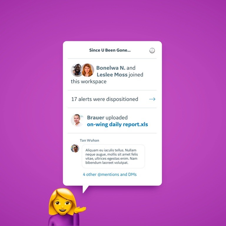
At our peak, I was managing a UX team researching initiatives slated for years out, and supporting 5 development pods.
With delivery teams forming, we whipped up a flexible information architecture. Dane and I continued to work seamlessly. While I documented user workflows, Dane smashed through tagging. We met in the middle to keep workflows and navigation from becoming rigid and siloed. We avoided recreating the 20 discrete apps and their functionality under one roof. Instead, we designed a series of services to filter, search, and prompts users to act.
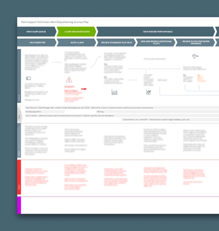
A pair of UX researchers, Anna D'ambrosio and Blake Lane, joined the team. I needed to keep research ahead of our roadmap, I prioritized and helped write research plans. I also continued to participate in research activities and synthesis. Together we met users, untangled 30 years worth of technical diagrams, and more. I helped synthesize findings that took researchers from Cincinnati to Seattle, Paris, and India. into actionable insights.
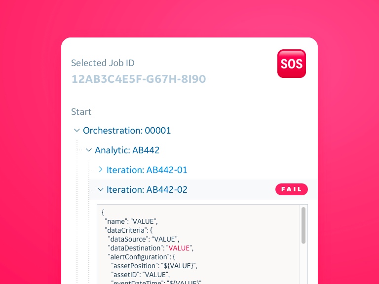
As development began, our scope grew even bigger. What about the analytics platform behind it all? There were clear benefits to providing a UI for GE data scientists. I would be accountable to the whole thing, so I'd need some help. James Robertson joined the crew, and eventually Mary Rinear. The team was able to deliver a solution that made it simple and safe to build and test analytics without disruption.
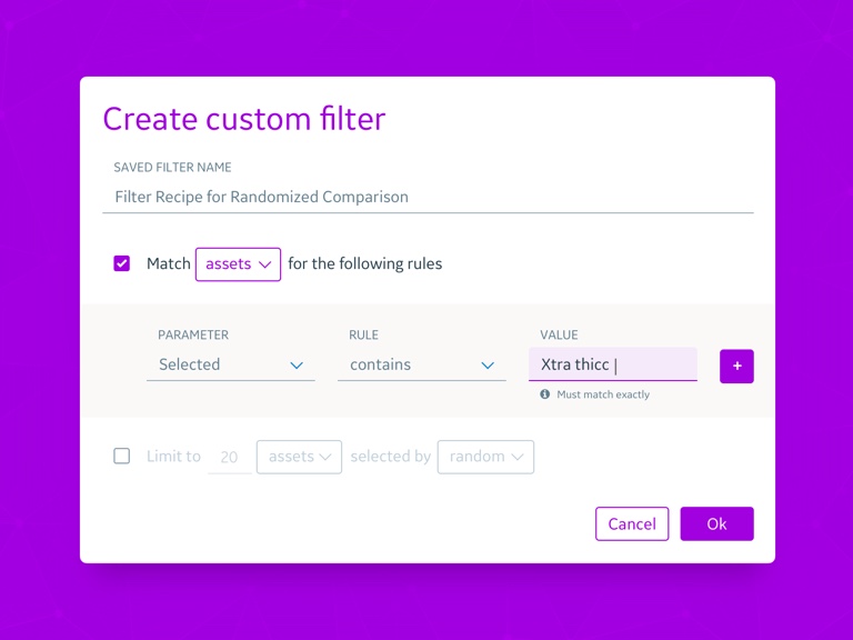
The front-end product,"Fleet Monitor X," was on an aggressive timeline. Bryce Woodward and Adam Davis came aboard to help. I found myself working strategically with product owners, and supporting agile teams in the USA and Bangalore, India. I instituted a design collaboration and critique process to keep everything cohesive.
Diversity and flexibility kept the UX team fresh. We gained another designer in India, and front-end developer Justin Egan joined UX as a UX Technologist. We also tried different methods where appropriate. In some instances, we delivered coded prototypes. In others, we delivered UI designs in Sketch. Different designers, different scrum teams, different ways of working. I also had the pleasure of pioneering Google Design Sprints at GE Aviation, facilitating many successful Sprints.
Unfortunately, airline travel declined sharply due to COVID-19 in early 2020. This meant a change in priorities and a slow down in product development for this project. With a flexible architecture, solid foundation, and growing design system, delivery continues. This also meant my role evolved. I continued to manage UX engagement for these products while growing and connecting outward to a larger problem space.